CREATING PACKAGING THAT BRINGS CREATIVE IMAGINATION WHILE STILL KEEPING IT PROFESSIONAL AND CLASSY.
Typical packaging design within the industry can be seen as quite minimal - staying with the use of branding, large format text - However for this project, that would be the approach which would reflect the direction the brand wanted to lead into.
The challenge was to create something bold, surreal, which would speak volume when viewed.


THE VISUAL IDENTITY OF THE PACKAGING
Understanding the brand was one thing; understanding how the packaging could visually elevate it was another.
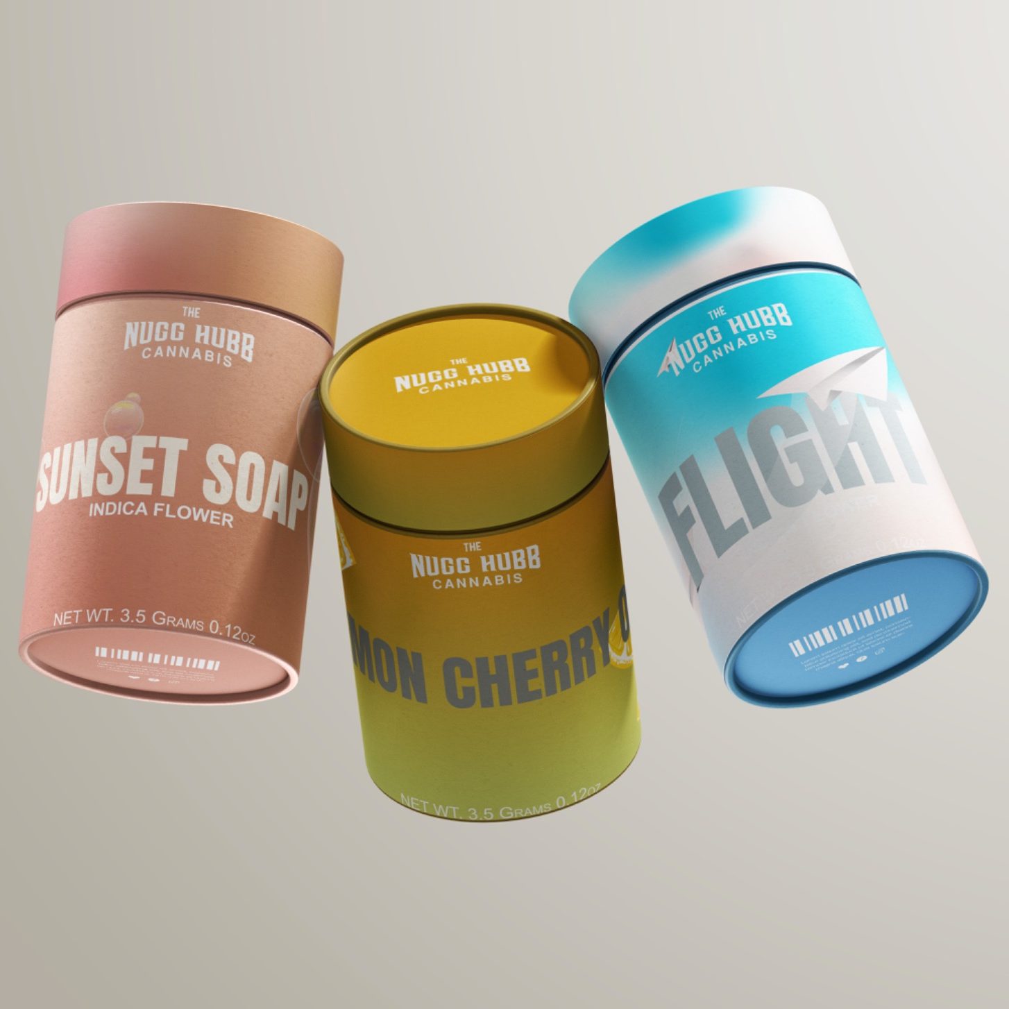
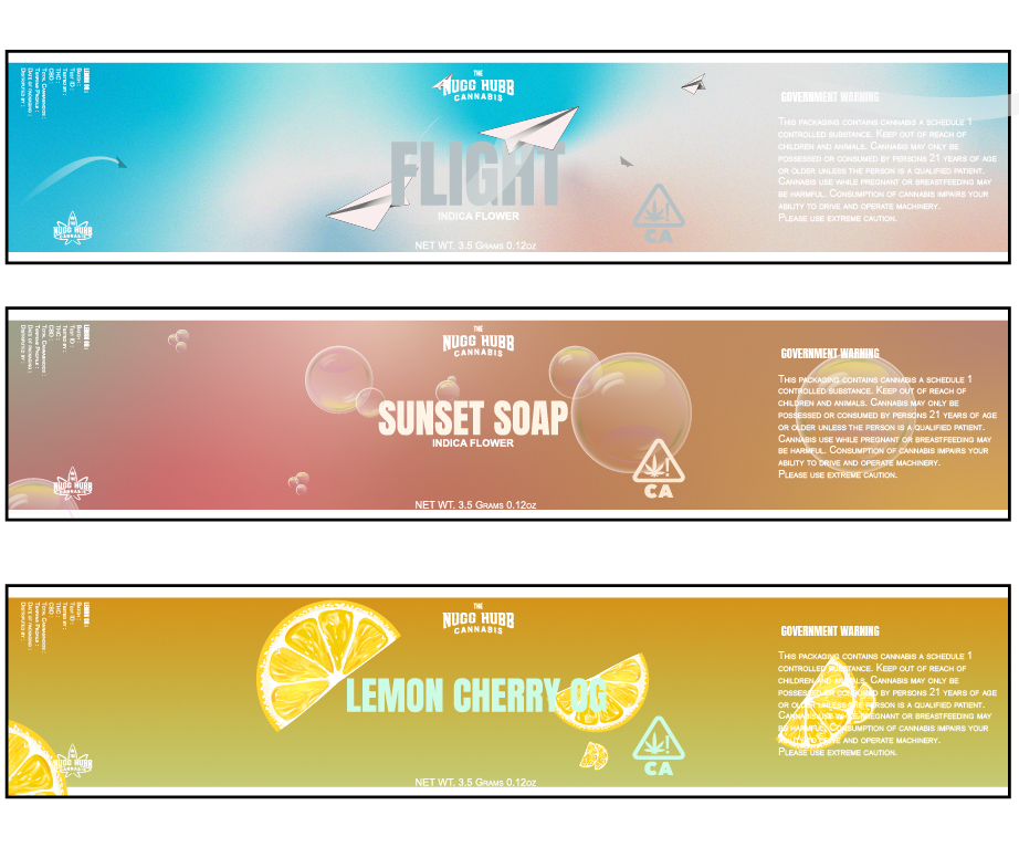
Packaging is the most tactile expression of the brand — it's what people first notice on the shelf, what they hold in their hands, and what gets passed around the table. It becomes the foundation of the identity.
Color and imagery do the heavy lifting. Bold palettes and illustrative compositions create a surreal atmosphere, with each label acting as a window into another world. Together, they build a visual narrative that extends beyond the product.